Interpret Linear Regression
Linear Regression has the reputation of being one of the easiest machine learning models to interpret. A visualization I have always really liked is the following: 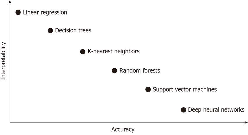 Source
We see that linear regression is at the top left where it is a model that is very interpretable, but does not provide much in the way of accuracy. If we are going to use linear regression for what it is the absolute best at, then we should be able to fully take advantage of the interpretability that it has.
For this post I am going to be demonstrating the interpretability of linear regression using the Bike Sharing Data Set from the UCI Machine Learning Repository.
To start I am going to be predicting the number of rental bikes for specific day (cnt in the dataset). I will be using the following features to do that:
season- summer, fall, winter, spring (categorical)holiday- 1 if holiday, 0 if not (categorical)workingday- 1 if day is neither weekend or holiday, 0 otherwise (categorical)weathersit- 1: clear, 2: misty, 3: light snow/light rain/thunderstorm, 4: heavy rain/ice (categorical)temp- temperature (numeric)hum- humidity (numeric)windspeed- speed of wind (numeric)days_since_2011- number of days since first day; used to handle trend in the data (numeric)
After fitting my model I got the following summary table from statsmodels: 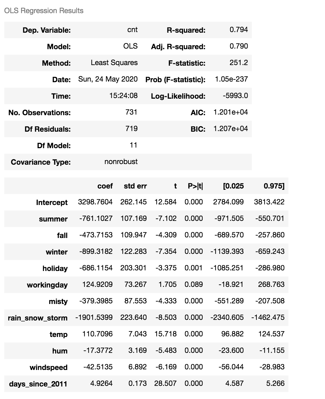
Interpret Categorical Feature
This table has a lot of really good information. Lets start interpretting what some of the coefficients mean. To start I am going to look at the coefficient for summer. summer is a dummy variable for the season category. I see that I have dummy variables for summer, fall, and winter. I do not have a dummy variable for spring this is incorporated into the intercept. The coefficient for summer is 761.1, this tells me that when the season is summer I expect to see 761 less bikes rented than spring. Which intuitively makes sense because summer typically has hotter weather and people will be less inclined to ride a bike during this period. We see that of the 4 seasons the base case spring captured in the intercept has the highest value, followed by fall. This again makes sense because spring and fall typically have nicer weather and people will be more inclined to ride a bike during these times.
Interpret Continuous Feature
Now I am going to look at the hum feature. The hum feature has a coefficient of -17.37 (as a reminder hum is the coefficient for humidity). This lets us know that when the humidity increases by 1 we would expect the number of people to rent bikes to decrease by -17.
I typically see this table as the only part of the interpretability that is presented on linear regression. I am now going to show 4 plots that can better show the results of your model after performing linear regression. To start with we have feature importance. Finally I will show how to interpret log transformed features.
Feature Importance
We can determine the most important feature by looking at the absolute value of the T-Statistic. The T-Statistic can be calculated by dividing the coefficient by the standard error.
\[T = \frac{\beta_i}{SE(\beta_i)}\]Looking at the feature importance for this particular problem, we get the following feature importances:
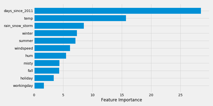
We see that days_since_2011 is the most important feature. This implies that as time has gone on, more people have rented bikes (there is an upward trend in this data). Next we see that temperature is the next most important feature.
This plot is much easier to identify what the most important feature are versus showing the summary plot. Next I am going to look at a weight plot.
Weight Plot
A weight plot is a way to visualize the different coefficients and their confidence intervals. The weight plot for this problem is the following: 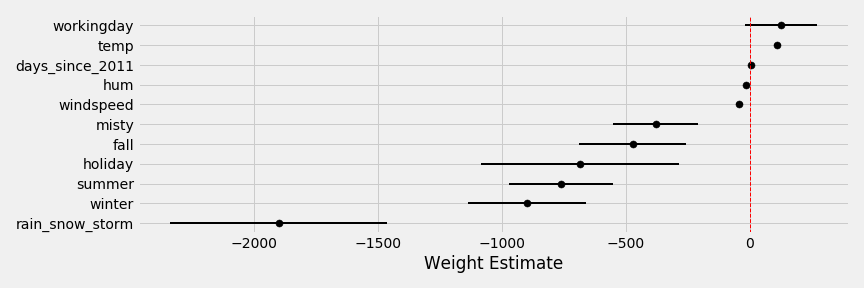
This how each feature impacts the model. When the weather is rain/snow/storm this has a large negative impact on number of bikes rented. While working day and temperature both have positive effects on the number of bikes purchased.
The Weight Plot does not take into consideration the scale of the data, which the next plot does.
Effect Plot
The Effect Plot multiplies the coefficient weight by each data point and then plots the range of values. This shows you the range of weights and values contribute to the prediction. The weight plot for this problem is the following: 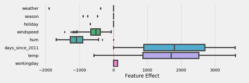
This shows that temperature and days since 2011 have the biggest effect on the prediction. We that the categorical feature weather can have a strong negative effect, a small negative effect, or no effect depending on the weather. Looking at the weight plot from earlier we saw that working day had the largest coefficient, but has a very small effect on the overall model.
Effect Plot with Individual Prediction
An effect plot can also be used to show an individual prediction. I have the following day:
- weather: clear
- season: fall
- wind speed: 11.83
- humidity: 62.38
- days since 2011: 302
- temperature: 7.00
- working day: 0
Using an effect plot I can see how individual effects compare with the distribution of effects from earlier.
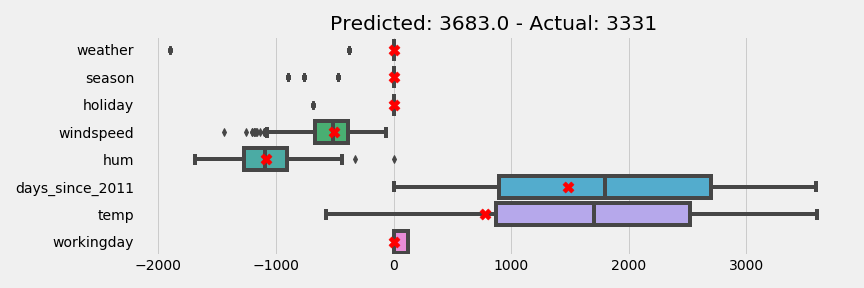
The red x are where the individual point fit on each distribution. We see that the temperature is below the median and the humidity is about at the median.
Log Transformed Features
Log-Lin Model
A log-lin model is a model where the dependent variable has been log transformed (note these interpretations are assuming the natural log has been performed) and the independent variable has not been transformed. Say we have the following model:
\[\log(cnt) = 7.65 + 0.04*temp\]This would mean that when the temperature increased by 1 unit the count of bikes rented increases by:
\(e^{0.04}\)
import numpy as np
np.exp(0.04)
1.0408107741923882
This means that when the temperature increases by 1 unit the count increases by 4%. You will also commonly see this interpreted as multiplying the coefficient by 100 - however this is has a little error involved in the calculation due to rounding.
Lin-Log Model
A lin-log model is a model where the independent variable has been log transformed and the dependent variable has not been transformed. Say we have the following model:
\[cnt = 875.95 + 1462.62*\log(temp)\]To interpret the temperature feature I would do the following. If I wanted to see what a 1% increase in temperature would do to the count of bikes rented:
\[\log(1.01)*1462.62\]np.log(1.01)*1462.62
14.553552912460713
This means that when the temperature increases by 1% the count in the number of bikes rented increases by 14.55. You will also commonly see this interpreted as dividing the coefficient by 100.
Log-Log Model
A log-log model is a model where both the independent and dependent variable have been log transformed. Say we have the following model:
\[\log(cnt) = 7.21 + 0.42*\log(temp)\]This can be interpreted as \(1.01^{0.42}\)
1.01**0.42
1.0041878837371854
A 1% increase in temperature would increase the number of bikes rented by 0.4%.
References
I used the following references very heavily in this post