Grouped Bar Charts and 100% Stacked Bar Chart
I am going to show how to make a grouped bar chart and a 100% stacked bar chart. To start I am going to load in a dataset. I want to look at the relationship between number of customer service calls vs whether the customer churned or not.
import pandas as pd
import matplotlib.pyplot as plt
df = pd.read_csv('churn.csv')
df.head()
| state | account length | area code | phone number | international plan | voice mail plan | number vmail messages | total day minutes | total day calls | total day charge | ... | total eve calls | total eve charge | total night minutes | total night calls | total night charge | total intl minutes | total intl calls | total intl charge | customer service calls | churn | |
|---|---|---|---|---|---|---|---|---|---|---|---|---|---|---|---|---|---|---|---|---|---|
| 0 | KS | 128 | 415 | 382-4657 | no | yes | 25 | 265.1 | 110 | 45.07 | ... | 99 | 16.78 | 244.7 | 91 | 11.01 | 10.0 | 3 | 2.70 | 1 | False |
| 1 | OH | 107 | 415 | 371-7191 | no | yes | 26 | 161.6 | 123 | 27.47 | ... | 103 | 16.62 | 254.4 | 103 | 11.45 | 13.7 | 3 | 3.70 | 1 | False |
| 2 | NJ | 137 | 415 | 358-1921 | no | no | 0 | 243.4 | 114 | 41.38 | ... | 110 | 10.30 | 162.6 | 104 | 7.32 | 12.2 | 5 | 3.29 | 0 | False |
| 3 | OH | 84 | 408 | 375-9999 | yes | no | 0 | 299.4 | 71 | 50.90 | ... | 88 | 5.26 | 196.9 | 89 | 8.86 | 6.6 | 7 | 1.78 | 2 | False |
| 4 | OK | 75 | 415 | 330-6626 | yes | no | 0 | 166.7 | 113 | 28.34 | ... | 122 | 12.61 | 186.9 | 121 | 8.41 | 10.1 | 3 | 2.73 | 3 | False |
5 rows × 21 columns
df.groupby('customer service calls')['churn'].value_counts()
customer service calls  churn
0                       False     605
                        True       92
1                       False    1059
                        True      122
2                       False     672
                        True       87
3                       False     385
                        True       44
4                       False      90
                        True       76
5                       True       40
                        False      26
6                       True       14
                        False       8
7                       True        5
                        False       4
8                       False       1
                        True        1
9                       True        2
Name: churn, dtype: int64
This is what I want to visualize. I am first going to use a grouped bar chart.
Grouped Bar Chart
Step 1: Make the above into a dataframe
# get value counts for non_churn calls
non_churn = df[df['churn'] == False]['customer service calls'].value_counts().sort_index()
# rename to non_churn
non_churn.rename('Non_Churn', inplace = True)
# get value counts for churn calls
churn = df[df['churn'] == True]['customer service calls'].value_counts().sort_index()
# rename to churn
churn.rename('Churn', inplace = True)

# combine the 2 pandas series into a dataframe
churn_df = pd.concat([non_churn, churn], axis = 1)
churn_df
| Non_Churn | Churn | |
|---|---|---|
| 0 | 605.0 | 92 |
| 1 | 1059.0 | 122 |
| 2 | 672.0 | 87 |
| 3 | 385.0 | 44 |
| 4 | 90.0 | 76 |
| 5 | 26.0 | 40 |
| 6 | 8.0 | 14 |
| 7 | 4.0 | 5 |
| 8 | 1.0 | 1 |
| 9 | NaN | 2 |
I am going to fill in the missing values with 0, this is because the data is not missing rather no calls were made
churn_df.fillna(0, inplace = True)
churn_df
| Non_Churn | Churn | |
|---|---|---|
| 0 | 605.0 | 92 |
| 1 | 1059.0 | 122 |
| 2 | 672.0 | 87 |
| 3 | 385.0 | 44 |
| 4 | 90.0 | 76 |
| 5 | 26.0 | 40 |
| 6 | 8.0 | 14 |
| 7 | 4.0 | 5 |
| 8 | 1.0 | 1 |
| 9 | 0.0 | 2 |
Step 2: Make Plot
with plt.style.context('fivethirtyeight'):
    churn_df.plot(kind = 'bar', figsize = (8, 6))
    plt.xticks(rotation = 0)
    plt.xlabel('Number of Customer Service Calls')
    plt.ylabel('Count of Customers')
    plt.title('Number of Customer Service Calls - Churn vs No Churn')

Step 3: Interpret the Graph
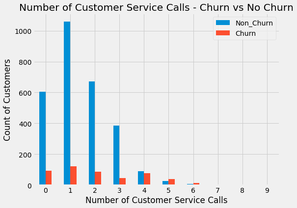
We see that when the number of customer service calls is between 0 and 3 there is a really high number of customers that did not churn. However, after 3 customer service calls the number of instances is very small so it is hard to determine the impact after that.
I am now going to show the same information with a 100% stacked bar chart. Note I’ll be using this great tutorial
100% Stacked Bar Chart
Step 1: Make Plot
# From raw value to percentage
totals = [i+j for i,j in zip(churn_df['Non_Churn'], churn_df['Churn'])]
greenBars = [i / j * 100 for i,j in zip(churn_df['Non_Churn'], totals)]
orangeBars = [i / j * 100 for i,j in zip(churn_df['Churn'], totals)]

with plt.style.context('fivethirtyeight'):
    # plot
    barWidth = 0.85
    names = churn_df.index
    # Create green Bars
    plt.bar(range(len(churn_df)), greenBars, color='#b5ffb9', edgecolor='white', width=barWidth, label = 'No Churn')
    # Create orange Bars
    plt.bar(range(len(churn_df)), orangeBars, bottom=greenBars, color='#f9bc86', edgecolor='white', width=barWidth,
           label = 'Churn')

    # Custom x axis
    plt.xticks(range(len(churn_df)), names)
    plt.xlabel("Number of Customer Service Calls")

    # Add a legend
    plt.legend(loc='upper left', bbox_to_anchor=(1,1), ncol=1)

Step 2: Interpret Graph
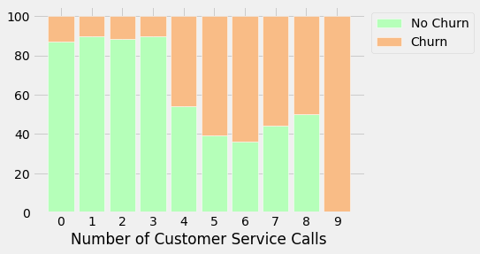
In this plot we see that the percent of customers that churn after 4 customer service calls increases significantly. My recommendation would be to prioritize customers that have made 2-3 customer service calls before they reach that 4 customer service calls threshold!