Finding High Leverage Points with Cook's Distance
High leverage points are points that have an unusual value for X. It is important to identify these points because they can have a large impact on linear regression models.
I am going to begin by creating a dataset.
from sklearn.datasets import make_regression
import pandas as pd
import matplotlib.pyplot as plt
import numpy as np
X, y = make_regression(n_features = 1, noise=10, random_state=11)
I am adding a data point that has an unusual data point.
X = np.append(X, [3])
y = np.append(y, [70])

df = pd.DataFrame(X, columns=['X'])
df['Y'] = y
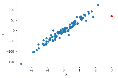
Plot my data and highlighting the unusual point as red.
plt.scatter(df['X'], df['Y'])
plt.scatter([3], [70], color = 'red')
plt.xlabel('X')
plt.ylabel('Y');

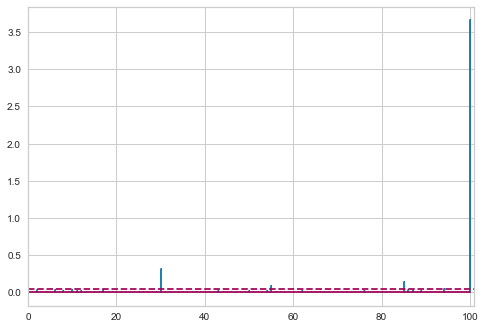
We see that the red point has the largest value of X and doesn’t fit the general trend of the rest of the data. I am going to use Cook’s Distance to measure how much influence each point has. Any point that has a large influence I want to be careful before I include it in my model.
from yellowbrick.regressor import CooksDistance

visualizer = CooksDistance()
visualizer.fit(df['X'].values.reshape(-1, 1), df['Y'])
/Users/jeffreyherman/opt/anaconda3/lib/python3.7/site-packages/sklearn/utils/deprecation.py:143: FutureWarning: The sklearn.metrics.classification module is  deprecated in version 0.22 and will be removed in version 0.24. The corresponding classes / functions should instead be imported from sklearn.metrics. Anything that cannot be imported from sklearn.metrics is now part of the private API.
  warnings.warn(message, FutureWarning)
/Users/jeffreyherman/opt/anaconda3/lib/python3.7/site-packages/sklearn/base.py:213: FutureWarning: From version 0.24, get_params will raise an AttributeError if a parameter cannot be retrieved as an instance attribute. Previously it would return None.
  FutureWarning)
/Users/jeffreyherman/opt/anaconda3/lib/python3.7/site-packages/yellowbrick/regressor/influence.py:183: UserWarning: In Matplotlib 3.3 individual lines on a stem plot will be added as a LineCollection instead of individual lines. This significantly improves the performance of a stem plot. To remove this warning and switch to the new behaviour, set the "use_line_collection" keyword argument to True.
  self.distance_, linefmt=self.linefmt, markerfmt=self.markerfmt


CooksDistance(ax=<matplotlib.axes._subplots.AxesSubplot object at 0x1c1f78ba50>)

df['Distance'] = visualizer.distance_
df.sort_values('Distance', ascending = False).head()
| X | Y | Distance | |
|---|---|---|---|
| 100 | 3.000000 | 70.000000 | 3.658567 |
| 30 | -2.653319 | -159.917692 | 0.307768 |
| 85 | 1.846365 | 64.508669 | 0.135441 |
| 55 | 2.156674 | 123.491855 | 0.087477 |
| 94 | 1.402771 | 47.531992 | 0.048779 |
We see that point 100 has a Cook’s Distance that is the largest (typically any point with a Cook’s Distance greater than 1 I will want to investigate).
Lets see what happens to our regression when we keep a point that has high leverage. I am going to build 2 regression models - the first one will have the high leverage point and the second one will not have the high leverage point.
import statsmodels.api as sm

X = df['X']
Y = df['Y']

# coefficient
X = sm.add_constant(X)

model_1 = sm.OLS(Y, X).fit()
model_1.summary()
/Users/jeffreyherman/opt/anaconda3/lib/python3.7/site-packages/statsmodels/tools/_testing.py:19: FutureWarning: pandas.util.testing is deprecated. Use the functions in the public API at pandas.testing instead.
  import pandas.util.testing as tm
| Dep. Variable: | Y | R-squared: | 0.926 |
|---|---|---|---|
| Model: | OLS | Adj. R-squared: | 0.926 |
| Method: | Least Squares | F-statistic: | 1246. |
| Date: | Tue, 28 Jul 2020 | Prob (F-statistic): | 6.87e-58 |
| Time: | 14:56:18 | Log-Likelihood: | -407.59 |
| No. Observations: | 101 | AIC: | 819.2 |
| Df Residuals: | 99 | BIC: | 824.4 |
| Df Model: | 1 | ||
| Covariance Type: | nonrobust |
| coef | std err | t | P>|t| | [0.025 | 0.975] | |
|---|---|---|---|---|---|---|
| const | -1.5736 | 1.377 | -1.143 | 0.256 | -4.306 | 1.159 |
| X | 49.8307 | 1.412 | 35.294 | 0.000 | 47.029 | 52.632 |
| Omnibus: | 62.244 | Durbin-Watson: | 1.371 |
|---|---|---|---|
| Prob(Omnibus): | 0.000 | Jarque-Bera (JB): | 403.422 |
| Skew: | -1.867 | Prob(JB): | 2.50e-88 |
| Kurtosis: | 12.051 | Cond. No. | 1.05 |
Warnings:
[1] Standard Errors assume that the covariance matrix of the errors is correctly specified.
from sklearn.metrics import mean_squared_error

mean_squared_error(df['Y'], model_1.predict(X))
187.3842053021652
X = df.drop(100)['X']
Y = df.drop(100)['Y']

# coefficient
X = sm.add_constant(X)

model_2 = sm.OLS(Y, X).fit()
model_2.summary()
| Dep. Variable: | Y | R-squared: | 0.952 |
|---|---|---|---|
| Model: | OLS | Adj. R-squared: | 0.951 |
| Method: | Least Squares | F-statistic: | 1933. |
| Date: | Tue, 28 Jul 2020 | Prob (F-statistic): | 2.59e-66 |
| Time: | 14:57:06 | Log-Likelihood: | -381.98 |
| No. Observations: | 100 | AIC: | 768.0 |
| Df Residuals: | 98 | BIC: | 773.2 |
| Df Model: | 1 | ||
| Covariance Type: | nonrobust |
| coef | std err | t | P>|t| | [0.025 | 0.975] | |
|---|---|---|---|---|---|---|
| const | -0.8252 | 1.115 | -0.740 | 0.461 | -3.037 | 1.386 |
| X | 52.5054 | 1.194 | 43.960 | 0.000 | 50.135 | 54.876 |
| Omnibus: | 7.213 | Durbin-Watson: | 1.615 |
|---|---|---|---|
| Prob(Omnibus): | 0.027 | Jarque-Bera (JB): | 9.901 |
| Skew: | -0.307 | Prob(JB): | 0.00708 |
| Kurtosis: | 4.414 | Cond. No. | 1.07 |
Warnings:
[1] Standard Errors assume that the covariance matrix of the errors is correctly specified.
mean_squared_error(df.drop(100)['Y'], model_2.predict(X))
121.70966154143105
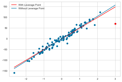
We see that the first model has a R^2 of 0.926 while the second model has a R^2 of 0.952. The first model has a MSE of 194.9 and the second model has a MSE of 121.7. Removing the high leverage improved both the R^2 and MSE. Now I am going to plot out both lines to see the impact.
Xnew = np.array([[1, df['X'].min()], [1, df['X'].max()]])
plt.scatter(df['X'], df['Y'])
plt.scatter([3], [70], color = 'red')
plt.plot([df['X'].min(), df['X'].max()], model_1.predict(Xnew), label = 'With Leverage Point', color = 'red')
plt.plot([df['X'].min(), df['X'].max()], model_2.predict(Xnew), label = 'Without Leverage Point')
plt.legend()
<matplotlib.legend.Legend at 0x1c2d5a9610>

The blue regression line (with the leverage point) is being pulled down towards that leverage point and is thus impacting the predictions for all the other data points.