Partial Dependency Plots
Partial Dependency Plots are a technique for showing the effect of a feature as it changes. I highly recommend taking a look at this tweet as a reference for how they are calculated.
I am going to show an example of this using the Titanic Dataset.
import pandas as pd

# load in dataset from github link
url = 'https://raw.githubusercontent.com/agconti/kaggle-titanic/master/data/train.csv'
df = pd.read_csv(url)

# minor data cleaning

# convert sex column to binary
df['Sex'] = df['Sex'].map(lambda x: 1 if x == 'female' else 0)

# drop any rows with missing values in the age column
df.dropna(subset = ['Age'], inplace= True)

# split my dataset into target variable (y) and predictors (X)
X = df[['Sex', 'Age', 'Fare']]
y = df['Survived']
Now I am going to fit a logistic regression model on the data
from sklearn.linear_model import LogisticRegression
est_lr = LogisticRegression().fit(X, y)
It’s time to see our first partial dependency plot!
from sklearn.inspection import plot_partial_dependence
import matplotlib.pyplot as plt

# make partial dependency plot for first feature (Sex)
plot_partial_dependence(est_lr, X, features = [0]);
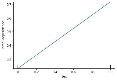
This shows that as the gender changes from 0 (males) to 1 (females) the probability of survival goes from under 0.3 to above 0.7. What if I wanted to see what the actual values were?
from sklearn.inspection import partial_dependence
partial_dependence(est_lr, X, features = [0])
(array([[0.23084278, 0.7173048 ]]), [array([0, 1])])
The probability of survival for males is 0.23 and the probability of survival for females is 0.72. Lets go through how these are calculated. The steps are as follows:
- Make a copy of our predictors
- Change Sex Column to be all 0s
- Make predictions with this new dataset (will need the probabilities)
- Take the mean of the probabilities
- Repeat but change the Sex column to be all 1s
# Make a copy of our predictors
X_male = X.copy()

# Change sex column to be all 0s
X_male['Sex'] = 0

#Make predictions with this new dataset (will need the probabilities)
male_prob = est_lr.predict_proba(X_male)[:, 1]
#need 2nd column to get probability of survival

# Take the mean of the probabilities
male_prob.mean()
0.23084277943739914
We see that this matches the probability from up above. Now I am going to repeat this for when the column is all 1s
# Make a copy of our predictors
X_female = X.copy()

# Change sex column to be all 0s
X_female['Sex'] = 1

#Make predictions with this new dataset (will need the probabilities)
female_prob = est_lr.predict_proba(X_female)[:, 1]

# Take the mean of the probabilities
female_prob.mean()
0.7173048001176113
Again matches up with our number from up above. We did this with a categorical feature, what does it look like for a continuous feature like age?
plot_partial_dependence(est_lr, X, features = [1]);
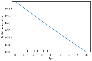
This shows that as the age increases the probability of survival decreases. Lets look at the raw numbers again.
partial_dependence(est_lr, X, features = [1])
(array([[0.45901091, 0.45854184, 0.45839178, 0.45824172, 0.45807294,
         0.45792292, 0.45604919, 0.45417814, 0.45230981, 0.4504442 ,
         0.44858135, 0.44672126, 0.44486396, 0.44300947, 0.4411578 ,
         0.43930898, 0.43746302, 0.43561993, 0.43377974, 0.43286074,
         0.43194246, 0.43010811, 0.4282767 , 0.42644826, 0.42462278,
         0.4228003 , 0.42189018, 0.42098082, 0.41916436, 0.41735093,
         0.41644536, 0.41554056, 0.41463651, 0.41373324, 0.411929  ,
         0.41012785, 0.4083298 , 0.40743194, 0.40653487, 0.40474306,
         0.40384834, 0.4029544 , 0.40116889, 0.40027732, 0.39938655,
         0.39760739, 0.396719  , 0.39583142, 0.39405865, 0.39317347,
         0.3922891 , 0.39052277, 0.38875969, 0.38699986, 0.38612116,
         0.38524329, 0.38348999, 0.38173998, 0.37999327, 0.37824987,
         0.37737942, 0.37650979, 0.37477304, 0.37303964, 0.37130959,
         0.36958291, 0.3678596 , 0.36613969, 0.36442318, 0.36271007,
         0.3610004 , 0.36014685, 0.35929415, 0.35759136, 0.35589202,
         0.35419616, 0.35250377, 0.35081488, 0.34912949, 0.34744762,
         0.34576928, 0.34409448, 0.34242324, 0.33577403, 0.33494693,
         0.33412073, 0.32918266, 0.31940583]]),
 [array([ 0.42,  0.67,  0.75,  0.83,  0.92,  1.  ,  2.  ,  3.  ,  4.  ,
          5.  ,  6.  ,  7.  ,  8.  ,  9.  , 10.  , 11.  , 12.  , 13.  ,
         14.  , 14.5 , 15.  , 16.  , 17.  , 18.  , 19.  , 20.  , 20.5 ,
         21.  , 22.  , 23.  , 23.5 , 24.  , 24.5 , 25.  , 26.  , 27.  ,
         28.  , 28.5 , 29.  , 30.  , 30.5 , 31.  , 32.  , 32.5 , 33.  ,
         34.  , 34.5 , 35.  , 36.  , 36.5 , 37.  , 38.  , 39.  , 40.  ,
         40.5 , 41.  , 42.  , 43.  , 44.  , 45.  , 45.5 , 46.  , 47.  ,
         48.  , 49.  , 50.  , 51.  , 52.  , 53.  , 54.  , 55.  , 55.5 ,
         56.  , 57.  , 58.  , 59.  , 60.  , 61.  , 62.  , 63.  , 64.  ,
         65.  , 66.  , 70.  , 70.5 , 71.  , 74.  , 80.  ])])
This shows that the probability of survival for an age of 0.42, our model predicts they will survive 0.459 on average. I’m going to verify this to make sure it makes sense.
# Make a copy of our predictors
X_age = X.copy()

# Change age column to be all 0.42
X_age['Age'] = 0.42

#Make predictions with this new dataset (will need the probabilities)
age_prob = est_lr.predict_proba(X_age)[:, 1]

# Take the mean of the probabilities
age_prob.mean()
0.4590109137958703
When choosing a linear classifier, you’ll notice that all of our features will have a partial dependency plot that is linear. Lets see what happens when I choose a classifier that is non-linear like a decision tree.
from sklearn.tree import DecisionTreeClassifier

est_dt = DecisionTreeClassifier().fit(X, y)
plot_partial_dependence(est_dt, X, features = [0]);
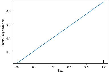
Partial dependency plot for Sex is still showing linear, but that makes sense because Sex can only be 2 options. Lets see what it looks like for Age.
plot_partial_dependence(est_dt, X, features = [1]);
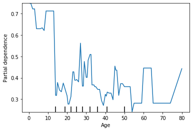
We see that the probability is relatively high for ages under 10 and has a lot of variability after that. To me, this suggests that our model is overfitting. Lets see what happens when I set a max depth on my decision tree.
est_dt = DecisionTreeClassifier(max_depth=7).fit(X, y)
plot_partial_dependence(est_dt, X, features = [1]);
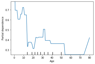
We see that by changing the max depth from None to 7 there is a lot less variability in the average prediction. A partial dependency plot can be a good check to make sure you model intuitively makes sense.
Now lets plot a partial dependency plot with 2 features
plot_partial_dependence(est_dt, X, features = [(1, 2)]);
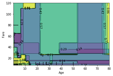
Now we are seeing the average survival rate of Age and Fare. We can see the highest probability for survival is when the Age is less than 20 and the fare is either really low or really high (these are the 2 yellow spots on the left). This makes sense because children were allowed on life boats first. We also see a yellow spot on the far right - this is for people who are over the age of 70 and had very expensive tickets.
You can also make a 3 dimensional plot.
import numpy as np
from mpl_toolkits.mplot3d import Axes3D
fig = plt.figure()

features = ('Age', 'Fare')
pdp, axes = partial_dependence(est_dt, X, features=features,
                              grid_resolution=20)
XX, YY = np.meshgrid(axes[0], axes[1])
Z = pdp[0].T
ax = Axes3D(fig)
surf = ax.plot_surface(XX, YY, Z, rstride=1, cstride=1,
                       cmap=plt.cm.BuPu, edgecolor='k')
ax.set_xlabel(features[0])
ax.set_ylabel(features[1])
ax.set_zlabel('Partial dependence')
#  pretty init view
ax.view_init(elev=22, azim=122)
plt.colorbar(surf)
plt.suptitle('Partial dependence of house value on median\n'
             'age and average occupancy, with Gradient Boosting')
plt.subplots_adjust(top=0.9)

plt.show()
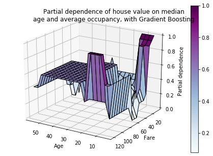
In my opinion, this plot does not provide much value