Visualize Tree Based Models
Going to show how to interpret the results of a decision tree.
First I am going to load in the default dataset. I will be using student, balance, and income to predict default.
import pandas as pd
import matplotlib.pyplot as plt

df = pd.read_csv('https://raw.githubusercontent.com/sik-flow/datasets/master/Default.csv')
df.head()
| default | student | balance | income | |
|---|---|---|---|---|
| 0 | 0 | 0 | 729.526495 | 44361.625074 |
| 1 | 0 | 1 | 817.180407 | 12106.134700 |
| 2 | 0 | 0 | 1073.549164 | 31767.138947 |
| 3 | 0 | 0 | 529.250605 | 35704.493935 |
| 4 | 0 | 0 | 785.655883 | 38463.495879 |
Fit a decision tree model to the data. I am not going to tune the hyperparameters (but would advise this as decision trees have a tendency to overfit).
from sklearn.tree import DecisionTreeClassifier

dt = DecisionTreeClassifier()
dt.fit(df.drop('default', axis = 1), df['default']);
Now lets visualize what our decision tree looks like.
from sklearn import tree
fig, axes = plt.subplots(nrows = 1,ncols = 1,figsize = (8,8), dpi=300)
tree.plot_tree(dt);
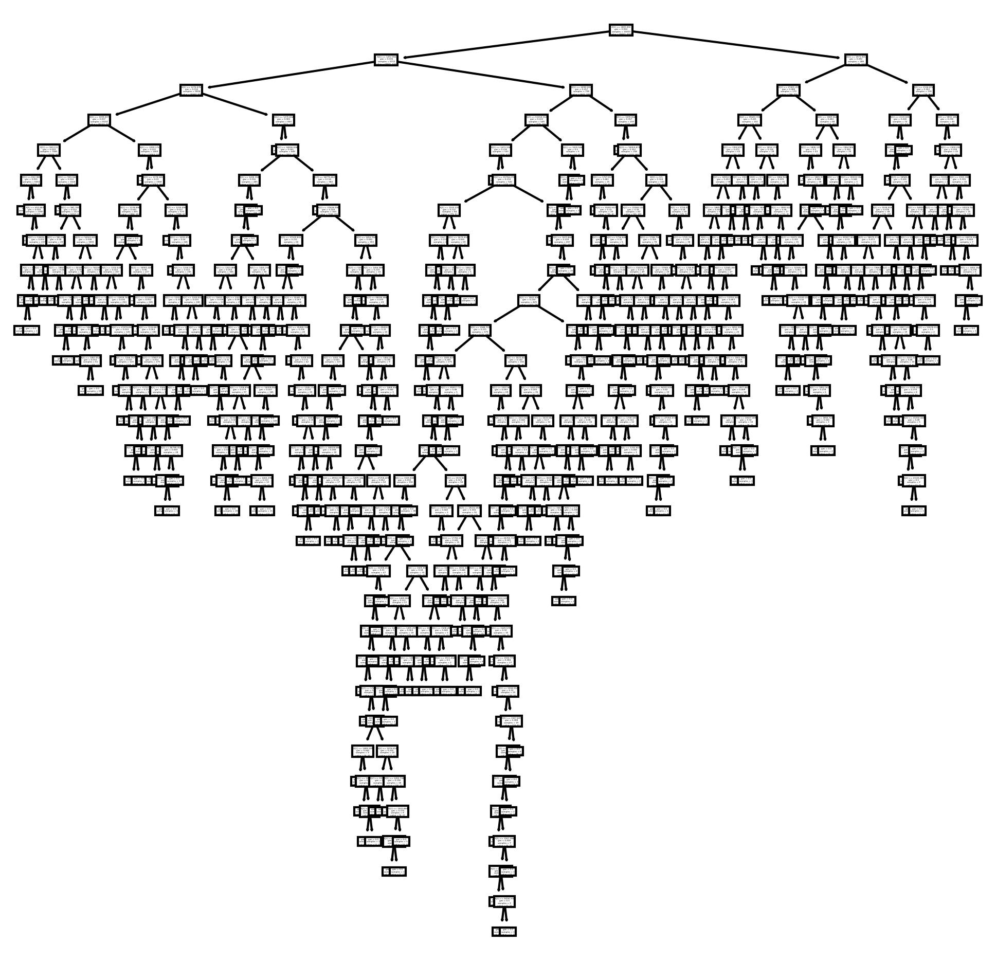
We see that the decision tree has so many nodes that it is not readable. I am going to set the max depth, so I can only see the top 2 layers of the tree. The top layers are typically the most important splits in the data.
fig, axes = plt.subplots(nrows = 1,ncols = 1,figsize = (8,8), dpi=300)
tree.plot_tree(dt, max_depth = 2);
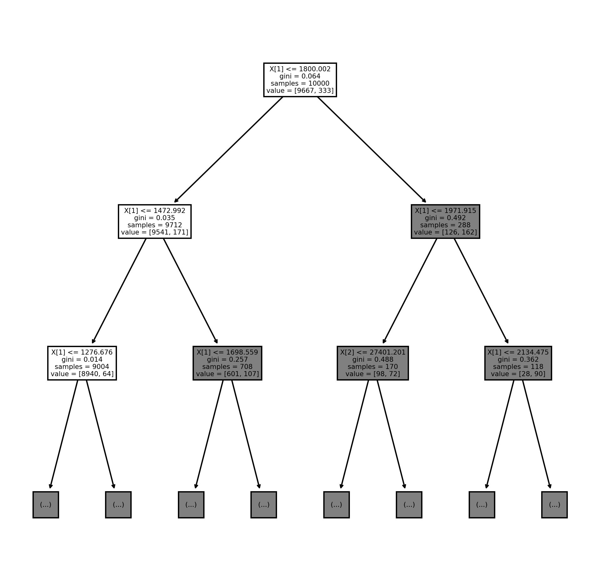
It is readable now, but it would be nice if we had the column labels instead of X[1], X[2], and X[3]. I am also going to be saving the image as a png.
fn=['student', 'balance', 'income']
cn=['not-default', 'default']
fig, axes = plt.subplots(nrows = 1,ncols = 1,figsize = (4,4), dpi=300)
tree.plot_tree(dt,
               feature_names = fn,
               class_names=cn,
               filled = True, max_depth = 2);
fig.savefig('tree.png')
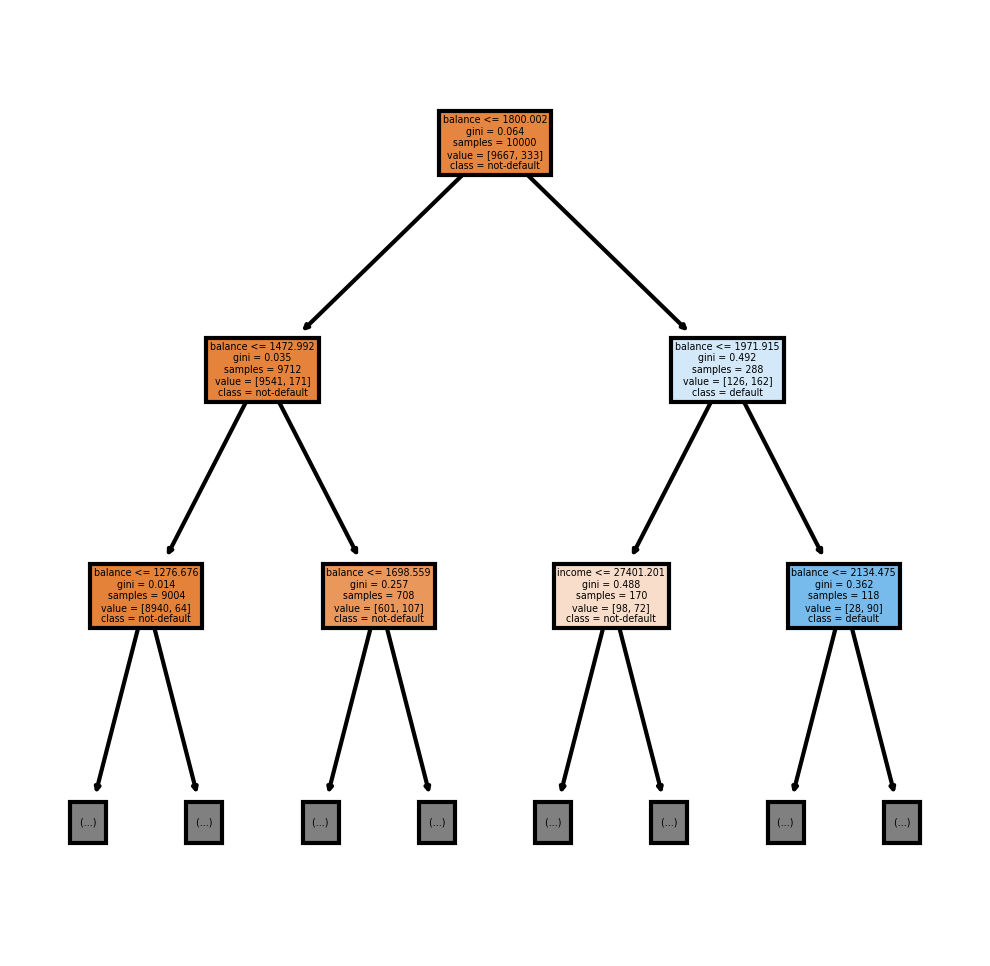
Now I am going to show how to see the feature importances. The feature importances tells us how each feature improved the purity of each node. These are normalized to a 100 scale.
plt.bar(df.drop('default', axis = 1).columns, dt.feature_importances_)
plt.title('Feature Importance');
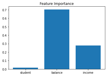
This means that balance accounted for about 70% of the improvement to purity, income accounted for about 30% of the improvement to purity and student accounted for less than 1%.
Now I am going to fit a random forest classifier and plot out some trees and look at the feature importance.
from sklearn.ensemble import RandomForestClassifier

rf = RandomForestClassifier()

rf.fit(df.drop('default', axis = 1), df['default']);
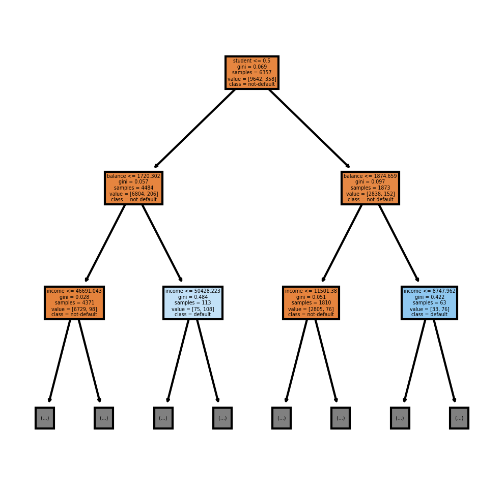
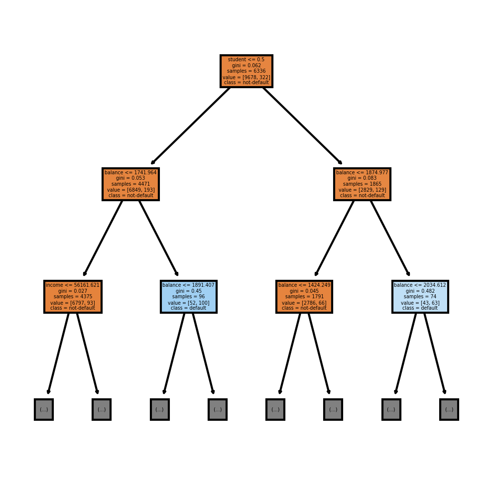
A random forest, by default, makes 100 decision trees. I can view the first decision tree by using rf.estimators_[0] and the second decision tree by using rf.estimators_[1]
fig, axes = plt.subplots(nrows = 1,ncols = 1,figsize = (4,4), dpi=300)
tree.plot_tree(rf.estimators_[0],
               feature_names = fn,
               class_names=cn,
               filled = True, max_depth = 2);
fig, axes = plt.subplots(nrows = 1,ncols = 1,figsize = (4,4), dpi=300)
tree.plot_tree(rf.estimators_[1],
               feature_names = fn,
               class_names=cn,
               filled = True, max_depth = 2);
Now to plot the feature importance
plt.bar(df.drop('default', axis = 1).columns, rf.feature_importances_)
plt.title('Feature Importance');
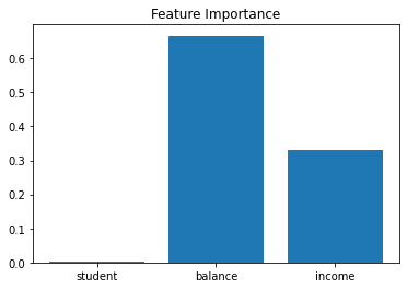
We see the values are similar to the decision tree